UI Designs
An intuitive and efficient case management system, focusing on user-friendly features such as quick navigation, customizable filters, and seamless case creation and updates using Jio Design syatem.
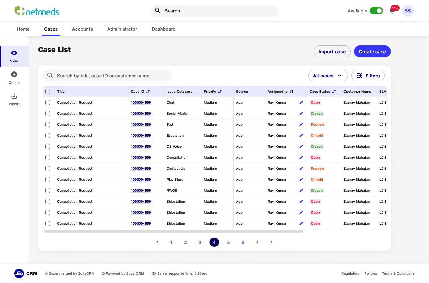
Case Listing Page
Case listing page to streamline workflows and enhance usability. The page features search functionality, an organized table for detailed case information, options to import or create cases, and advanced filters for efficient navigation.
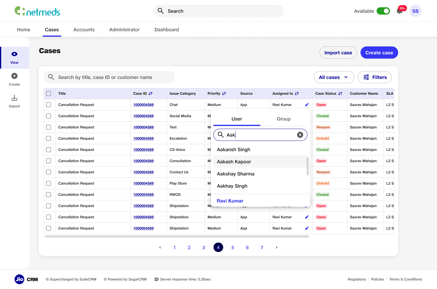
Feature to reassign task
Task reassignment feature within the case listing page, allowing users to quickly reassign tasks to other team members. This feature enhances workflow efficiency and ensures seamless task management directly from the listing view.
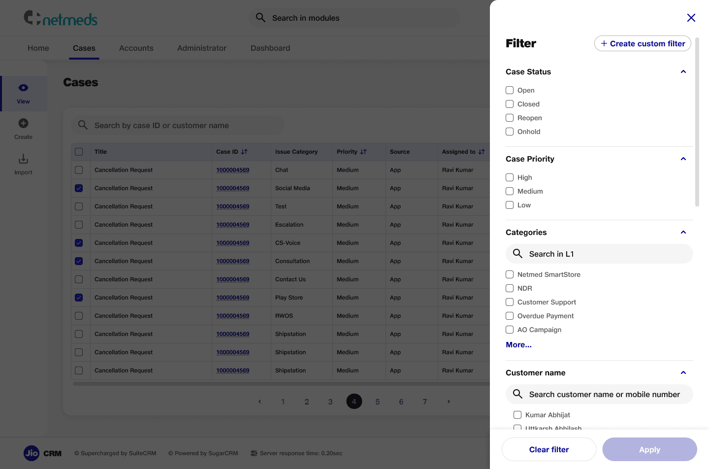
Filters
A filter section for the case listing page, enabling users to refine the view based on detailed criteria such as status, priority, and categories. This feature improves navigation and helps users quickly find relevant cases.
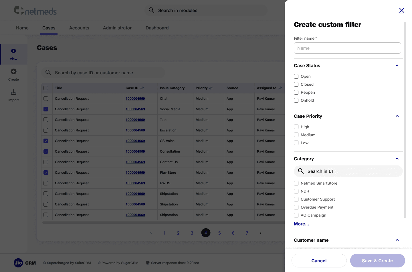
Custom Filters
A custom filter section that allows users to create quick filters for frequently used criteria. This feature addresses user needs by providing a more efficient way to access relevant cases, enhancing personalization and workflow speed.
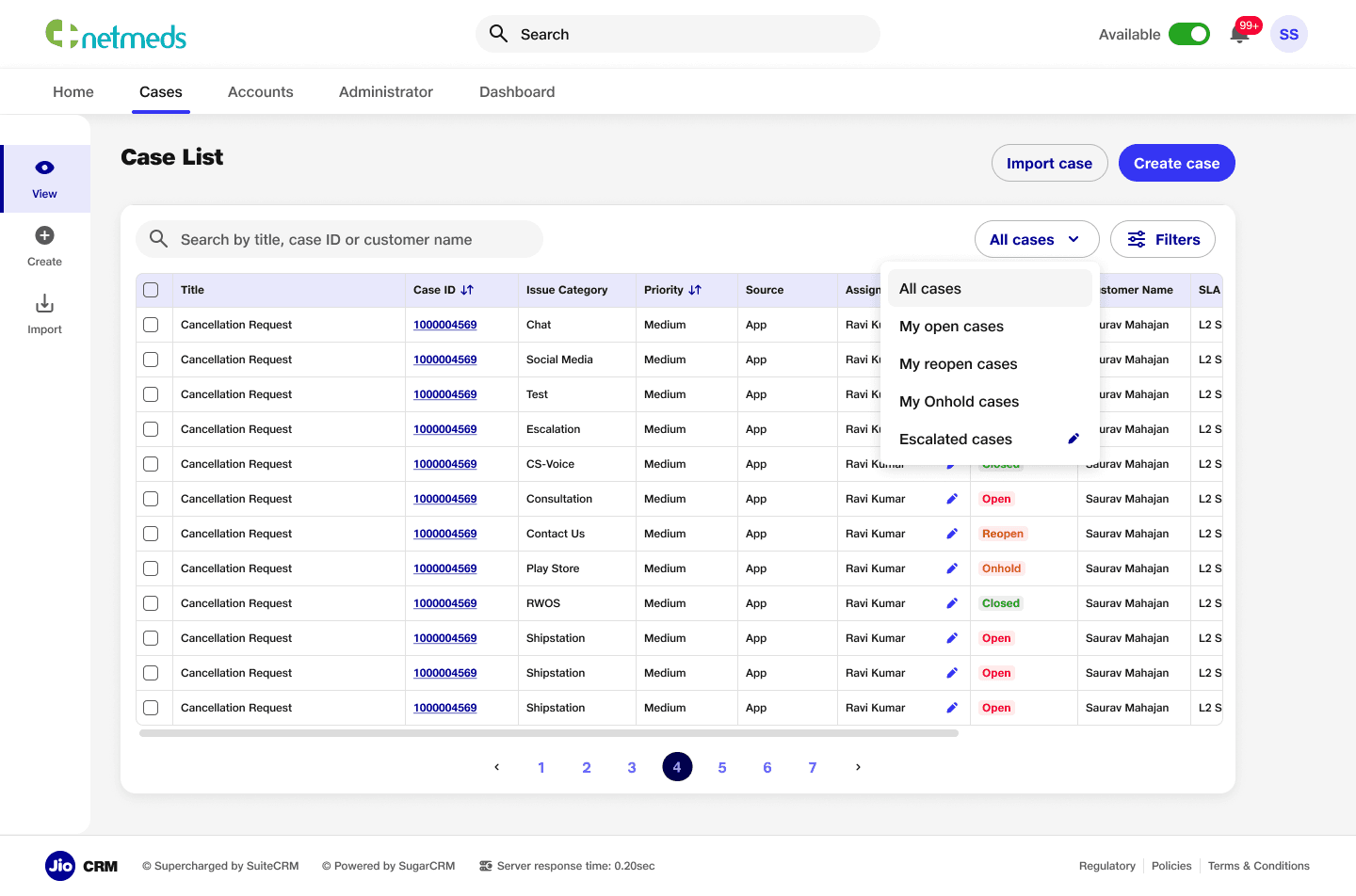
Quick Filters
A quick filter section integrated into the case listing page, featuring predefined backend filters and custom filters created by users. Each custom filter includes an edit icon, allowing users to easily modify filters according to their specific needs.
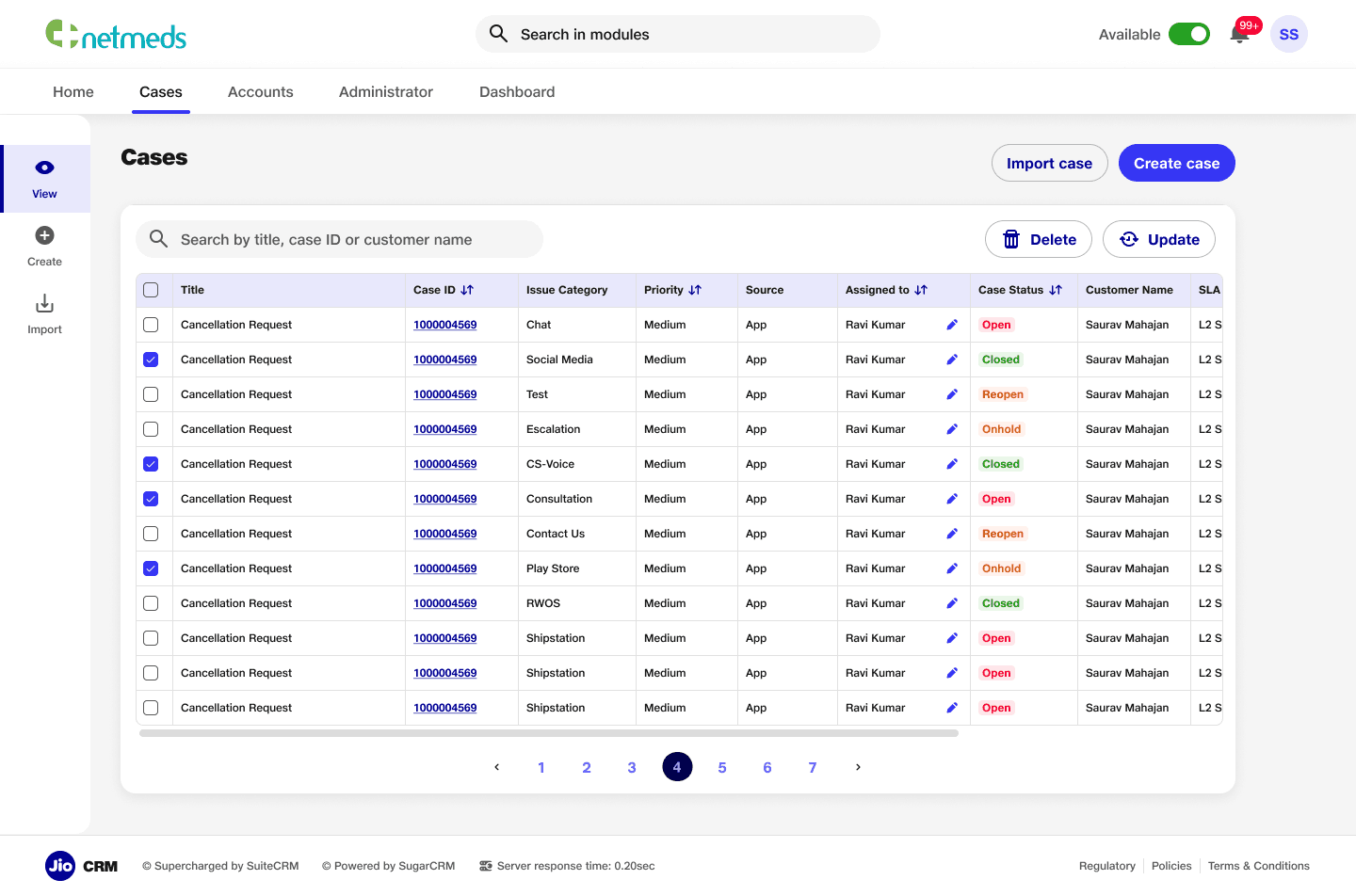
Update/Delete
Feature for easy access to update and delete cases directly from the listing page, ensuring quick actions without cluttering the screen, prioritising user convenience and maintains a clean, organised interface.
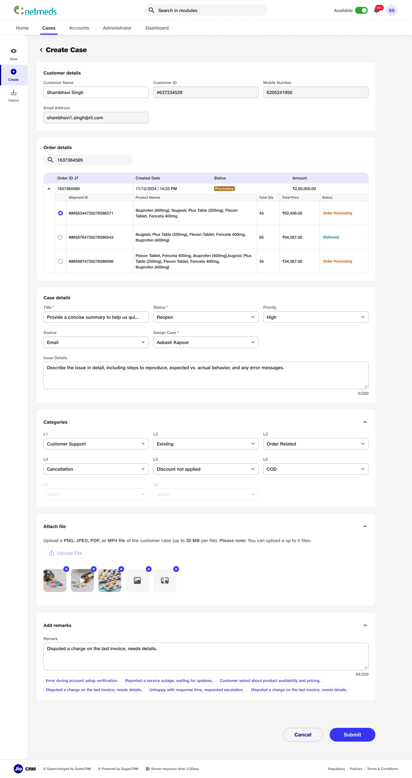
Case Creation
Detailed creation page with simplified forms and intuitive navigation for creating new cases. The layout streamlines the process, making it easy for users to input information and submit cases efficiently, enhancing the overall user experience.
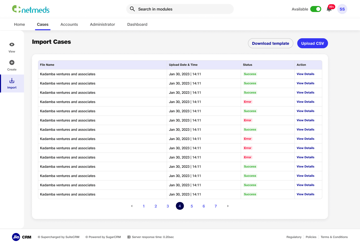
Bulk Case Creation
An import cases section to allow users to upload cases in bulk, featuring a download template option to prevent errors or mismatches. This ensures accurate data entry and improves the efficiency of case management.
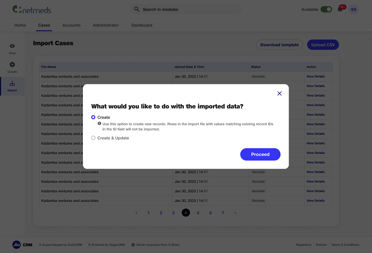
Bulk Case Creation Modes
Multiple modes in the CSV upload feature to prevent mismanagement and ensure accurate data handling.
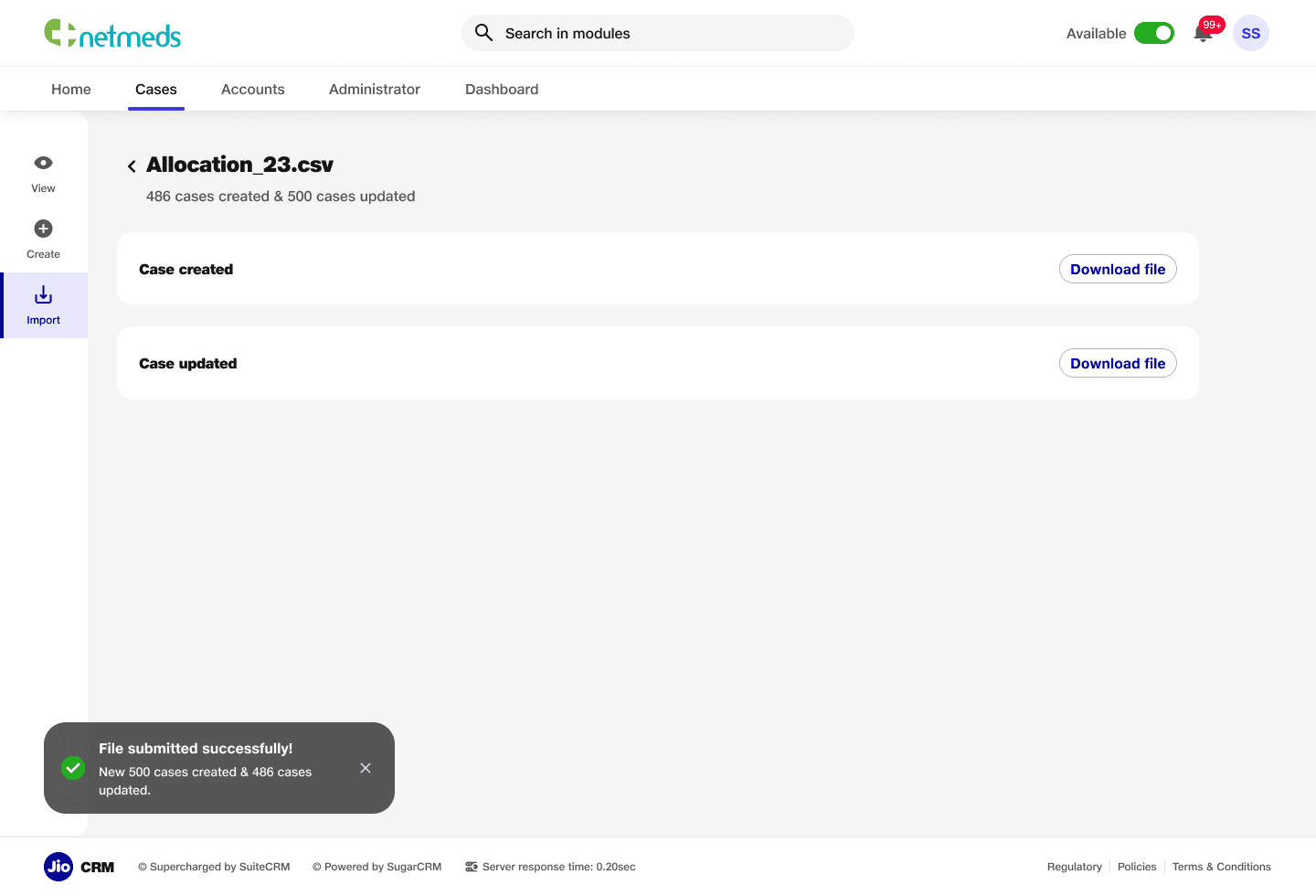
Uploaded File Data
A success page that displays updated data after case creation or modification. This page provides users with clear confirmation and visibility of the changes made, ensuring transparency.
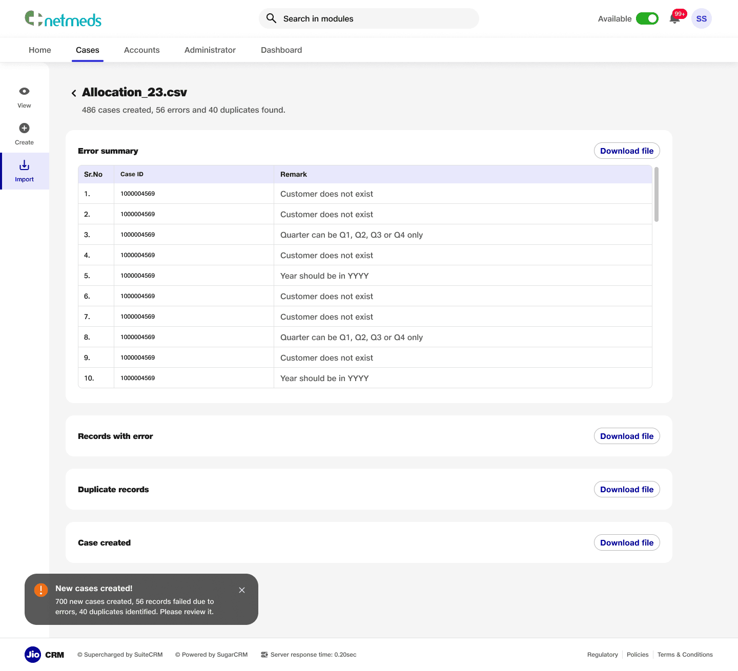
Uploaded File Data (Errors)
An error table that displays issues by case ID when errors occur during case creation or updates. Users can download a CSV file containing all the error or duplicate fields, providing a clear and efficient way to address and resolve issues.
Case Details- Emails
Case detail page featuring quick navigation to other cases with customisable filters. The page includes key features such as customer details, case information, and a communication trail, displaying interactions like emails, calls, and activities, enabling users to easily track and manage case progress.

About
Features
Pricing
GET STARTED
About
Features
Pricing
GET STARTED
Title Copy Goes Here Be Awesome
Lorem ipsum dolor sit amet, consectetur adipiscing elit. Suspendisse varius enim in eros elementum tristique. Duis cursus, mi quis viverra ornare, eros dolor interdum nulla, ut commodo diam libero vitae erat.
GET STARTED

Title Copy Goes Here Be Awesome
Lorem ipsum dolor sit amet, consectetur adipiscing elit. Suspendisse varius enim in eros elementum tristique. Duis cursus, mi quis viverra ornare, eros dolor interdum nulla, ut commodo diam libero vitae erat.
GET STARTED
Title Copy Goes Here
Lorem ipsum dolor sit amet, consectetur adipiscing elit. Suspendisse varius enim in eros elementum tristique.
GET STARTED
Jio X CRM
Lead: Aakash | UX Designers: Shambhavi & Sourabh
The Jio CRM project was initiated to develop a tailor-made Customer Relationship Management (CRM) system for Jio. Previously reliant on a third-party CRM product, Jio aimed to transition to a custom-built solution to address specific business needs, improve operational efficiency, and enhance user experience. This strategic shift focused on creating a robust, intuitive, and scalable platform that could support diverse workflows across various business modules.
Subsets of the Project
The Jio CRM platform was designed to encompass multiple subsets, including:
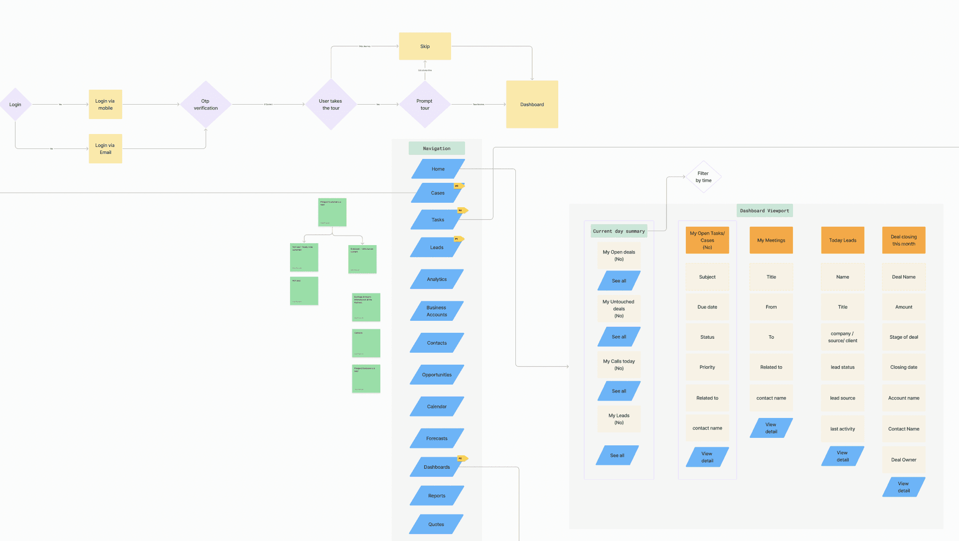
Platform Navigation & Homepage: Centralizing access to modules like cases, sales, administration, and dashboards.
Case Management Module: Enabling end-to-end lifecycle management of customer cases.
Email Communication System: Automating case creation and communication workflows based on inbound and outbound emails.
Real-Time Reporting Dashboards: Providing actionable insights into team performance and SLA compliance.
Administration and Access Management: Streamlining user roles and permissions for efficient platform governance.
Problem
Jio's existing reliance on a third-party CRM created several limitations, including inadequate customization, suboptimal navigation, and misalignment with Jio's unique operational workflows. The need for a bespoke solution arose to ensure seamless integration, enhanced data insights, and alignment with Jio’s strategic goals.
Goal
The project aimed to:
Build a fully customized CRM tailored to Jio's operational requirements.
Create a scalable architecture to support multiple workflows and user roles.
Enhance user experience through intuitive navigation and functional dashboards.
Streamline customer case management to improve SLA adherence.
Enable robust reporting capabilities for real-time insights
Process
The development of the Jio CRM platform followed a structured and iterative process:
Benchmarking: We began by analyzing industry-leading CRM systems to identify best practices and standards for functionality and usability.
Insight Extraction: Stakeholder interviews and user feedback were gathered to pinpoint key pain points in the existing CRM and prioritize feature requirements.
Information Architecture (IA): A detailed IA was crafted to ensure logical flow and accessibility across modules while accommodating scalability.
UI Design: Visual designs were developed to align with Jio’s branding guidelines, emphasizing clarity, responsiveness, and user engagement.
Development and Testing: Agile sprints were employed to develop features incrementally, followed by rigorous testing to address usability issues and technical bugs.
Launch and Feedback: An MVP was deployed for internal use, with feedback loops established to identify areas for improvement and inform subsequent iterations.
Timeline
The first launch of the Jio CRM platform followed a phased approach:
Benchmarking and Insight Extraction: Identifying best practices and user pain points from the existing CRM system.
Information Architecture Creation: Defining a cohesive structure for the platform.
UI/UX Design and Development: Creating a user-centric interface that aligns with Jio’s branding.
Initial Deployment and Feedback Collection: Launching a minimum viable product (MVP) for internal evaluation and iterative refinement.
Use cases
Platform Navigation: Simplifying user access to essential modules like cases, sales, and administration.
Case Management: Facilitating manual and automated ticket creation, tracking, and resolution across diverse customer touchpoints.
Real-Time Dashboards: Empowering managers with actionable insights into team performance and SLA compliance.
Email Integration: Seamlessly integrating inbound and outbound email workflows for streamlined communication.
Customizable Homepage Dashlets: Providing users with quick access to critical tasks and reports based on their roles.
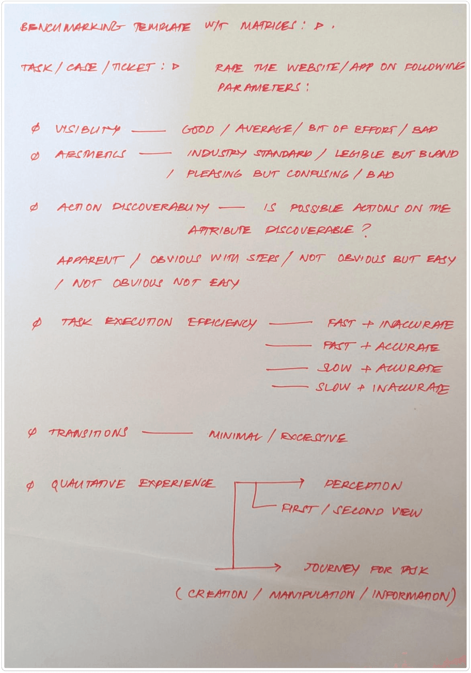
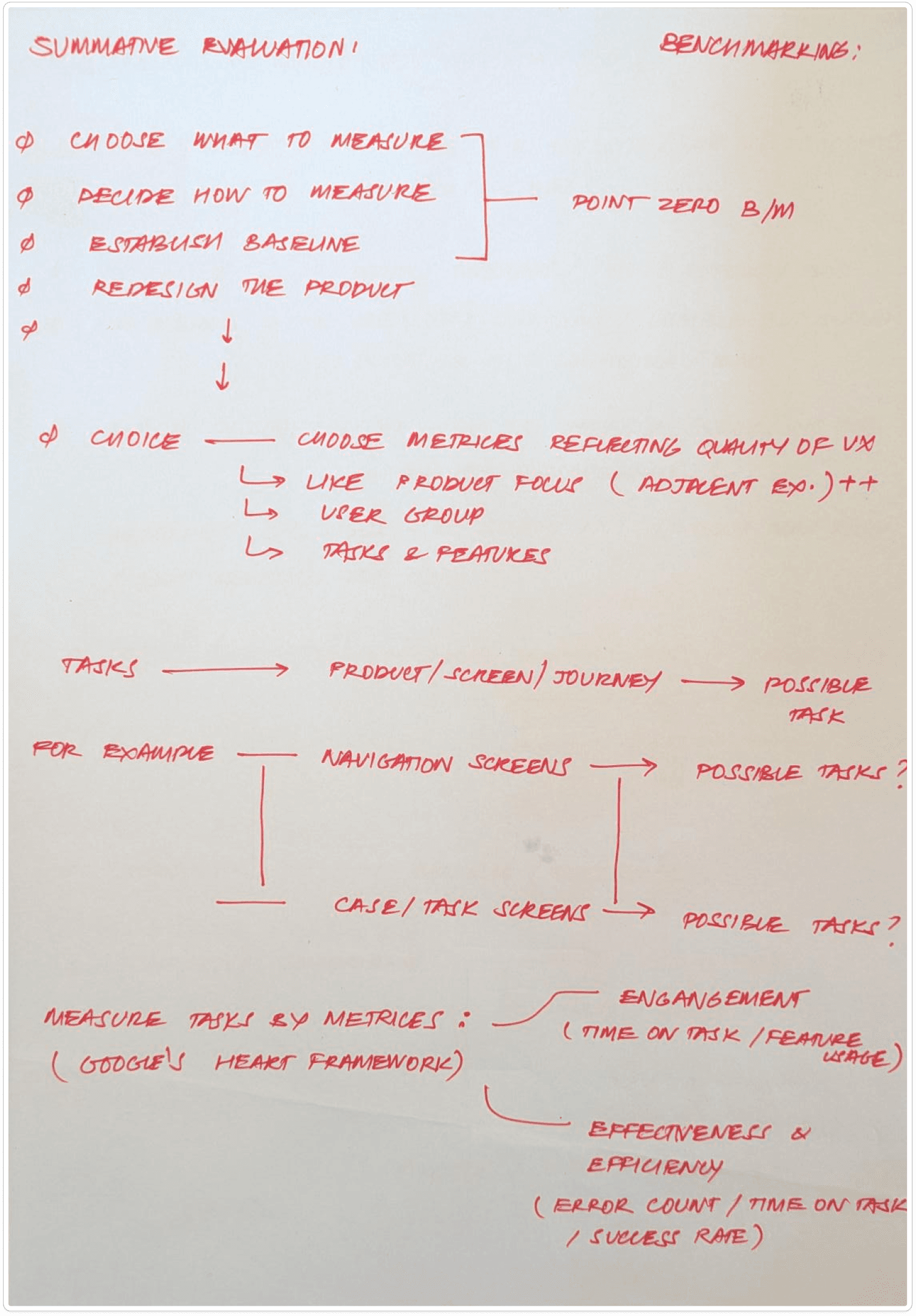
Benchmarking
Principes
Choose What to Measure: Focus on parameters directly impacting user experience, scalability, and workflow efficiency.
Decide How to Measure: Use qualitative and quantitative measures such as heuristic evaluation, task analysis, and user satisfaction scores.
Establish Baselines: Define industry standards as benchmarks for comparison.
Matrices Reflecting Future Usage: Align evaluation with future scalability and engagement metrics.
Engagement and Efficiency: Prioritize metrics that measure user engagement, ease of adoption, and operational effectiveness.
Parameters
Visibility: Clarity and accessibility of key features.
Aesthetics: Visual appeal without compromising functionality.
Action Discoverability: Ease of finding and performing actions.
Task Execution Efficiency: Speed and ease of completing tasks.
Qualitative Experiences: Perception, user journeys, and overall satisfaction.
Navigation Benchmarking | Attributes
Modularity and Scalability: Adaptability for diverse workflows and user hierarchies.
Search and Triangulation: Ease of finding data and navigating interconnected modules.
Menus and Interactions: Efficiency of menu layouts and space management.
HubSpot | Takeaways
Strengths: Aesthetic and user-friendly UI with contextual search and filters, dropdown menus, and a spacious workspace for tables and modules.
Weaknesses: Options are nested to reduce intimidation but hinder expert usability and scalability.
Challenges: Icon-heavy UI creates a learning curve for new users.
Layout: Standard two-column layout with collapsible side menus and horizontal scrolling workspace.
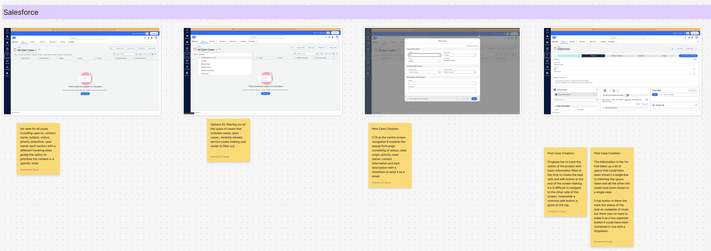
Salesforce | Takeaways
Strengths: Scalable, modular UI with essential features prominently displayed. Excellent contextual search capabilities.
Weaknesses: Transition-heavy interfaces for menu navigation. Some options are overly spread out, reducing workflow efficiency.
Layout: Modular information displays over menu-based transitions, ensuring scalability and task specificity.
Zoho CRM/Desk | Takeaways
Strengths: Clean and modern UI with drag-and-drop features for cases. AI bot for task automation.
Weaknesses: Inconsistent navigation patterns (e.g., side vertical navigation replacing headers). Poor integration of search functionality.
Layout: Filter-heavy interface that can overwhelm users when selecting multiple filters.
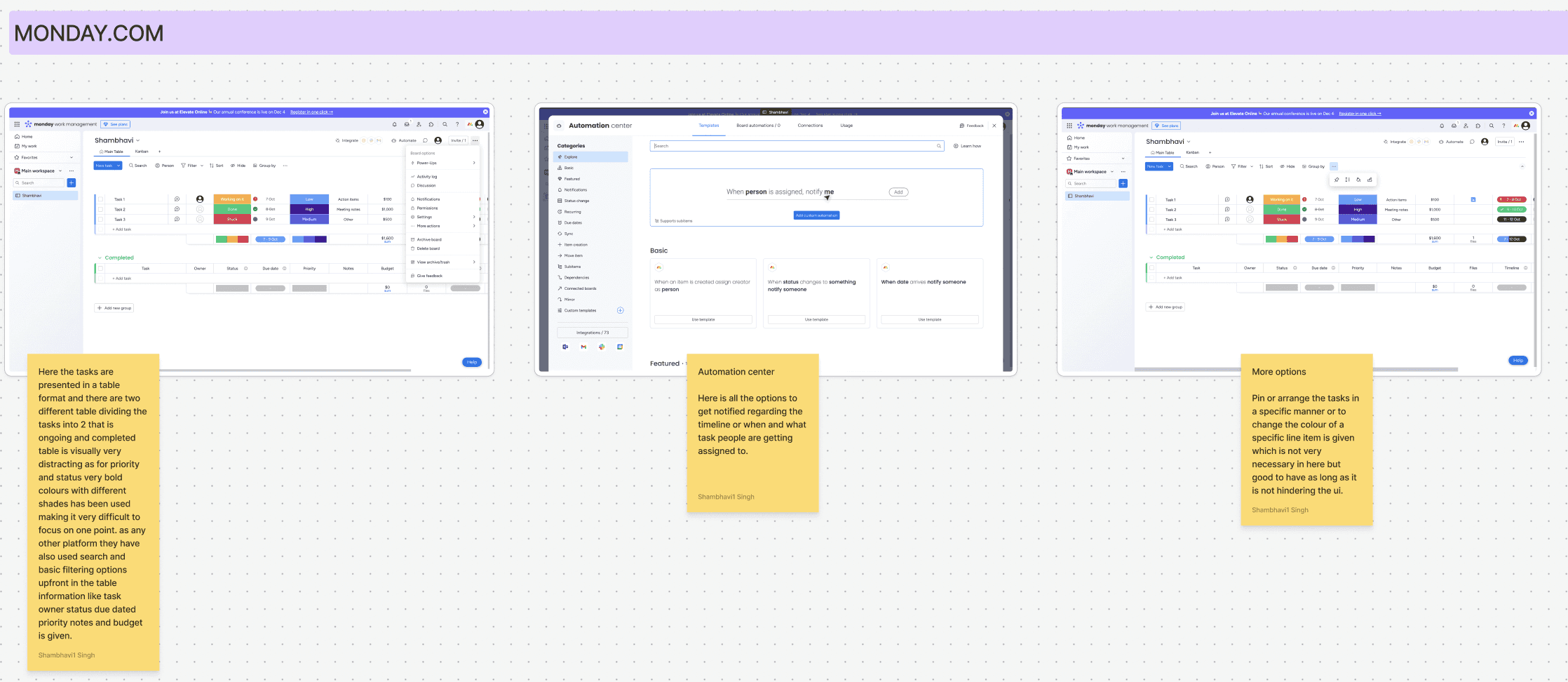
Monday.com | Takeaways
Strengths: Intuitive dashboard for data visualization and task management. Simplified interactions for casual users.
Weaknesses: Non-scalable, with proprietary interaction patterns limiting experienced user workflows.
Layout: Table-based task views with limited nesting capacity and bold color schemes that can be visually distracting.
Recommendations and Suggestions
Navigation
Contextual search can be a derivative of the UX patterns from Salesforce for scale and Monday.com for agent/individual oriented search queries.
Reducing information clutter / displaying the necessary ones (not necessarily minimalist) should not involve nesting or hiding same options inside drawers or drop-downs.
Standard navigation layout follows four section pattern; headers, left navigation pane (collapsible) , right contextual menus and horizontally scrollable central workspace. Side navigation menus instead of header based menus appear scalable and modern but hinder context sacrificing width of the menu for vertical scrollability. A combination of these attributes can be taken forward as per as the requested modules and features.
Contextual sub-headers are old established patterns for navigating inside a module in the workspace even though not presented in the benchmarking studies but relevant in SaaS softwares.
Tickets/Cases/Tasks
Table formats should be unified with contextual sort/filter on top right or in proximity of the tabular data, merge repeated actions and near options inside a single dropdown and have ticket modification actions to be in close proximity to the ticket and by corollary the table.
Semantic color indication of ticket states should be sparingly used or not used if not relevant as semantic warnings or indications do not visually scale for repeated usage.
Ticket data entry and input is highly dependent on the attribute count of the ticket/case in question and a scalable approach should be treaded here carefully as the more scalable option would not be the most user friendly; ex: modals/right contextual menus for detailed views and actions.
Aesthetically pleasing ticket view, management and attribute editing UI are not necessarily more UX friendly even at the cost of appearing old. One must highly prioritise efficiency and execution of tickets more than the legible and UI friendly one as transitions and nested features do not scale for multiple entries.
Tickets, Cases, and Tasks Benchmarking | Attributes
Modularity and Scalability: Support for multi-tier workflows and extensive data attributes.
Search and Triangulation: Efficient navigation and search functionalities.
Menus and Interactions: Unified interaction design for task creation and management.
Salesforce | Takeaways
Strengths:
Comprehensive list view with hover states and filtering options.
Case creation includes a detailed pop-up form with attributes like status, case origin, and task descriptions.
Efficient filtering options with primary filters upfront and secondary filters nested.
Weaknesses:
Overuse of space for primary case details.
Redundant buttons for marking task status (e.g., "Complete" and "Close" could be combined).
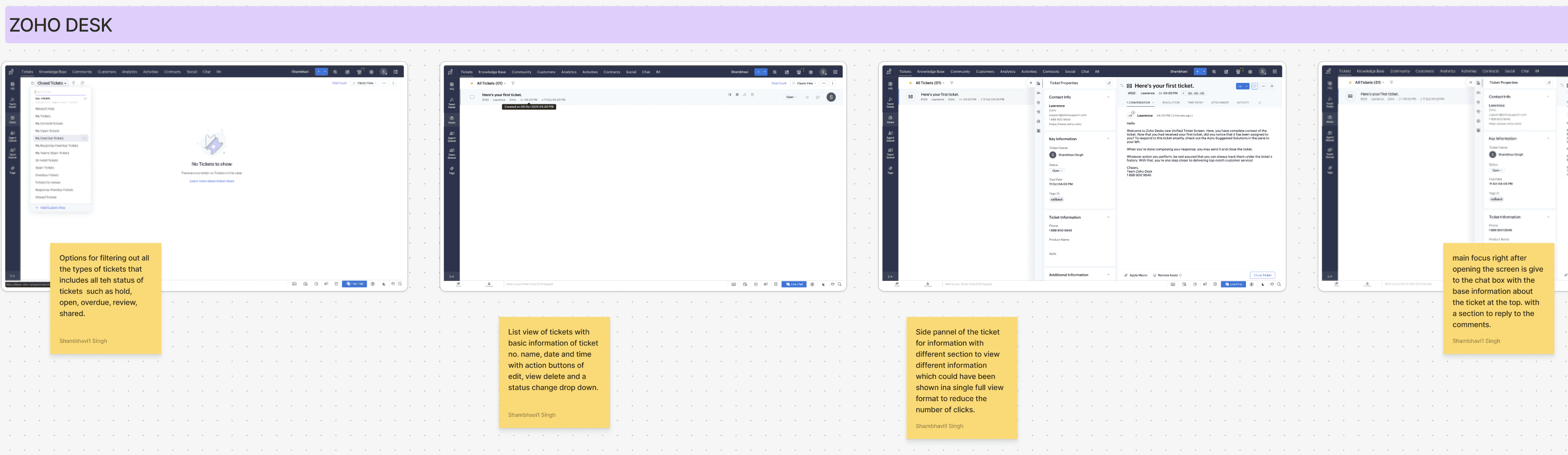
Zoho Desk | Takeaways
Strengths:
List view of tickets with actionable buttons for editing, viewing, and deleting.
AI-powered bot for task assistance and user support.
Weaknesses:
Timeline and additional information require unnecessary clicks.
Confirmation windows are inconsistently placed, increasing cognitive load.
Zoho CRM | Takeaways
Strengths:
Drag-and-drop interface for task prioritization.
Filters are easily accessible with checkboxes for quick selection.
Weaknesses:
Filter design can overwhelm users when handling multiple options.
Task detail layout could better utilize screen space by grouping details horizontally.
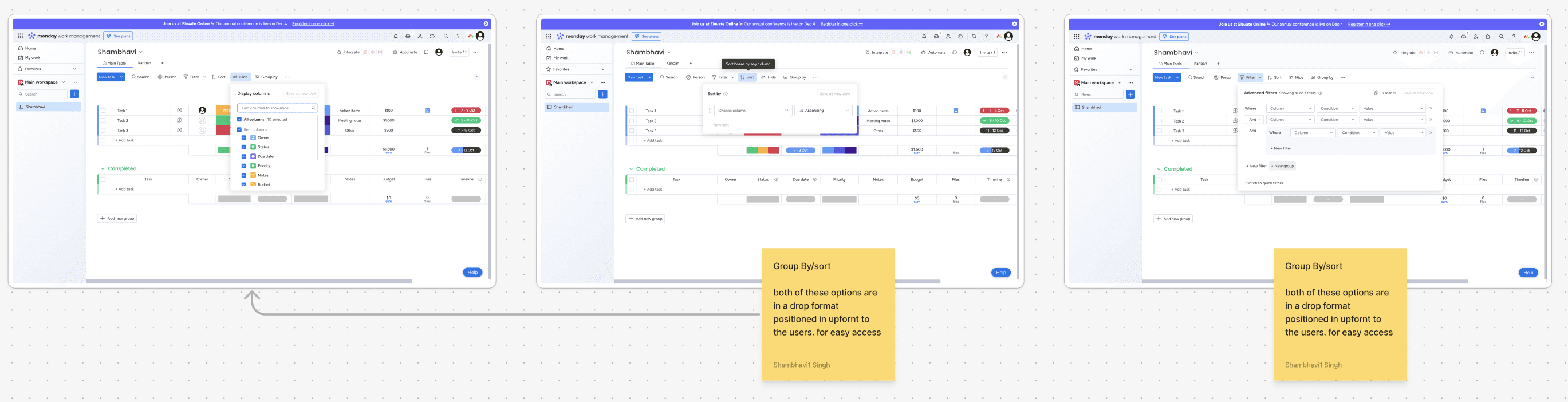
Monday.com | Takeaways
Strengths:
Table-based task segmentation into "Ongoing" and "Completed" categories.
Automation center for notifications and task timelines.
Weaknesses:
Bold color schemes hinder readability.
Dropdown-heavy filters complicate navigation.
HubSpot | Takeaways
Strengths:
Collapsible status-wise segregation for tasks.
Side navigation bar UI simplifies filter management.
Weaknesses:
Overlays in the side menu disrupt workspace focus.
Inconsistent navigation patterns for ticket attributes.
Information Architecture
Brief
Requirement Gathering
Benchmarking
Insight extration
IA Creation
&
UI Design
Initial Deployment
&
Feedback Collection
Reiteration
Future Scope
The next steps for the JCRM project involve deploying the MVP for initial testing and gathering user feedback. Insights from this phase will guide improvements to the current design solutions. Concurrently, work will begin on developing additional modules, including Accounts, Administrator, and Dashboard, to expand the platform's functionality and deliver a comprehensive user experience.
Key Learnings
Thriving in Fast-Paced Environments: Managed tight timelines with quick iterations to deliver quality solutions.
Cross-Functional Collaboration: Worked closely with Product Managers and Developers to address challenges and align on solutions.
User-Centric Problem Solving:Designed solutions that balanced technical feasibility with user needs.
Building from Scratch: Developed a product from the ground up, shaping its structure, flow, and design.
Iterative Design: Adapted quickly to feedback, refining designs to meet evolving requirements.
Business and User Alignment: Translated business goals into intuitive, user-focused design solutions.
UI Designs
An intuitive and efficient case management system, focusing on user-friendly features such as quick navigation, customizable filters, and seamless case creation and updates using Jio Design syatem.
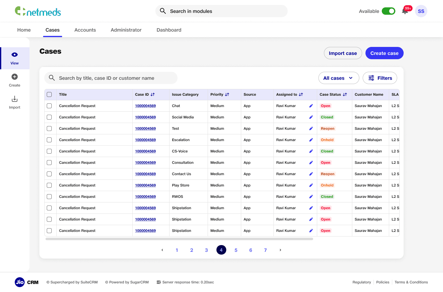
Case Listing Page
Case listing page to streamline workflows and enhance usability. The page features search functionality, an organized table for detailed case information, options to import or create cases, and advanced filters for efficient navigation.
Feature to reassign task
Task reassignment feature within the case listing page, allowing users to quickly reassign tasks to other team members. This feature enhances workflow efficiency and ensures seamless task management directly from the listing view.
Filters
A filter section for the case listing page, enabling users to refine the view based on detailed criteria such as status, priority, and categories. This feature improves navigation and helps users quickly find relevant cases.
Custom Filters
A custom filter section that allows users to create quick filters for frequently used criteria. This feature addresses user needs by providing a more efficient way to access relevant cases, enhancing personalization and workflow speed.
Quick Filters
A quick filter section integrated into the case listing page, featuring predefined backend filters and custom filters created by users. Each custom filter includes an edit icon, allowing users to easily modify filters according to their specific needs.
Update/Delete
Feature for easy access to update and delete cases directly from the listing page, ensuring quick actions without cluttering the screen, prioritising user convenience and maintains a clean, organised interface.
Case Creation
Detailed creation page with simplified forms and intuitive navigation for creating new cases. The layout streamlines the process, making it easy for users to input information and submit cases efficiently, enhancing the overall user experience.
Bulk Case Creation
An import cases section to allow users to upload cases in bulk, featuring a download template option to prevent errors or mismatches. This ensures accurate data entry and improves the efficiency of case management.
Bulk Case Creation Modes
Multiple modes in the CSV upload feature to prevent mismanagement and ensure accurate data handling.
Uploaded File Data
A success page that displays updated data after case creation or modification. This page provides users with clear confirmation and visibility of the changes made, ensuring transparency.
Uploaded File Data (Errors)
An error table that displays issues by case ID when errors occur during case creation or updates. Users can download a CSV file containing all the error or duplicate fields, providing a clear and efficient way to address and resolve issues.
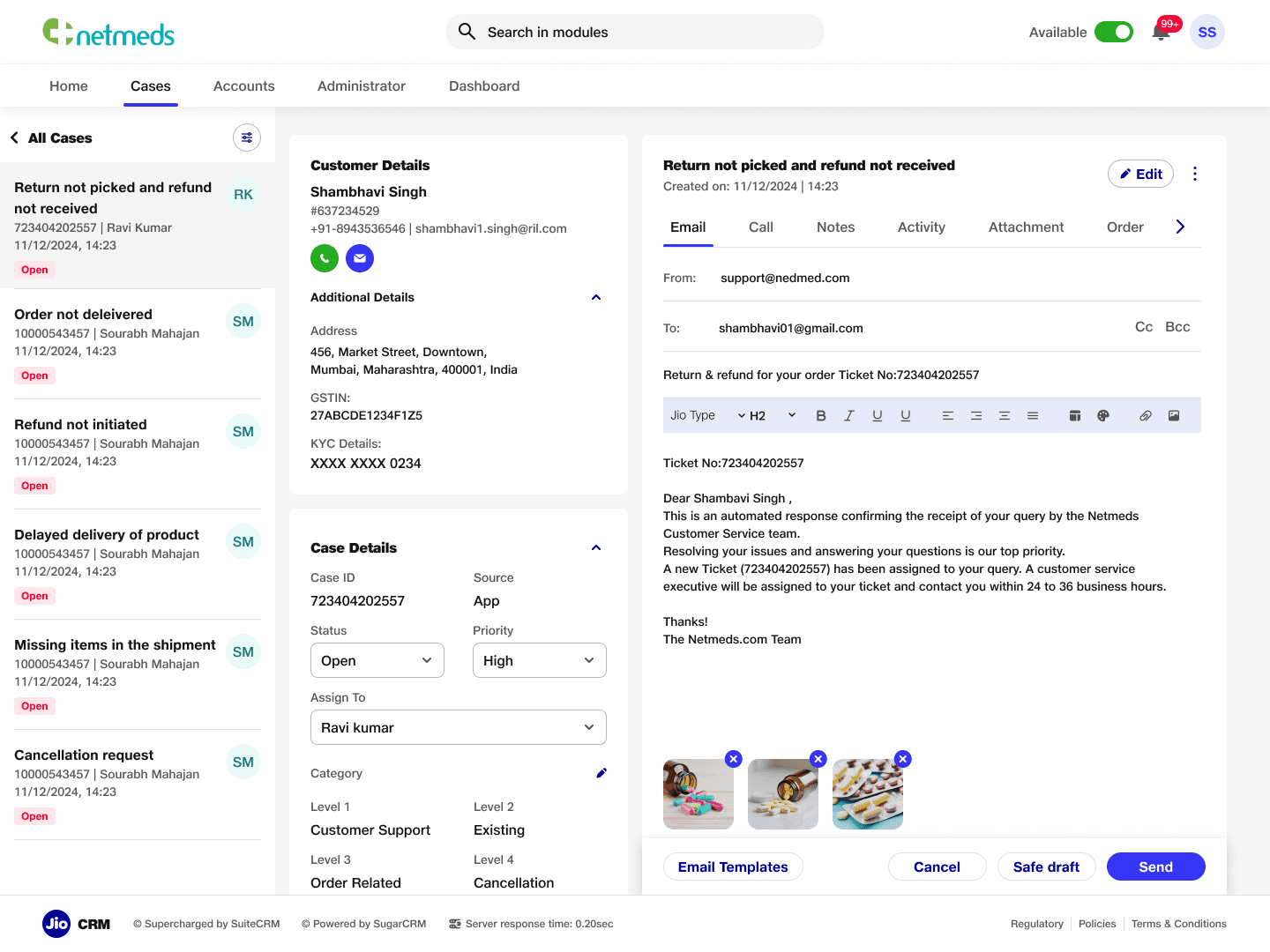
Case Details- Emails
Case detail page featuring quick navigation to other cases with customisable filters. The page includes key features such as customer details, case information, and a communication trail, displaying interactions like emails, calls, and activities, enabling users to easily track and manage case progress.
About
Features
Pricing
GET STARTED
About
Features
Pricing
GET STARTED
Title Copy Goes Here Be Awesome
Lorem ipsum dolor sit amet, consectetur adipiscing elit. Suspendisse varius enim in eros elementum tristique. Duis cursus, mi quis viverra ornare, eros dolor interdum nulla, ut commodo diam libero vitae erat.
GET STARTED
Title Copy Goes Here Be Awesome
Lorem ipsum dolor sit amet, consectetur adipiscing elit. Suspendisse varius enim in eros elementum tristique. Duis cursus, mi quis viverra ornare, eros dolor interdum nulla, ut commodo diam libero vitae erat.
GET STARTED
Title Copy Goes Here
Lorem ipsum dolor sit amet, consectetur adipiscing elit. Suspendisse varius enim in eros elementum tristique.
GET STARTED
Jio X CRM
Lead: Aakash | UX Designers: Shambhavi & Sourabh
The Jio CRM project was initiated to develop a tailor-made Customer Relationship Management (CRM) system for Jio. Previously reliant on a third-party CRM product, Jio aimed to transition to a custom-built solution to address specific business needs, improve operational efficiency, and enhance user experience. This strategic shift focused on creating a robust, intuitive, and scalable platform that could support diverse workflows across various business modules.
Subsets of the Project
The Jio CRM platform was designed to encompass multiple subsets, including:
Platform Navigation & Homepage: Centralizing access to modules like cases, sales, administration, and dashboards.
Case Management Module: Enabling end-to-end lifecycle management of customer cases.
Email Communication System: Automating case creation and communication workflows based on inbound and outbound emails.
Real-Time Reporting Dashboards: Providing actionable insights into team performance and SLA compliance.
Administration and Access Management: Streamlining user roles and permissions for efficient platform governance.
Problem
Jio's existing reliance on a third-party CRM created several limitations, including inadequate customization, suboptimal navigation, and misalignment with Jio's unique operational workflows. The need for a bespoke solution arose to ensure seamless integration, enhanced data insights, and alignment with Jio’s strategic goals.
Goal
The project aimed to:
Build a fully customized CRM tailored to Jio's operational requirements.
Create a scalable architecture to support multiple workflows and user roles.
Enhance user experience through intuitive navigation and functional dashboards.
Streamline customer case management to improve SLA adherence.
Enable robust reporting capabilities for real-time insights
Process
The development of the Jio CRM platform followed a structured and iterative process:
Benchmarking: We began by analyzing industry-leading CRM systems to identify best practices and standards for functionality and usability.
Insight Extraction: Stakeholder interviews and user feedback were gathered to pinpoint key pain points in the existing CRM and prioritize feature requirements.
Information Architecture (IA): A detailed IA was crafted to ensure logical flow and accessibility across modules while accommodating scalability.
UI Design: Visual designs were developed to align with Jio’s branding guidelines, emphasizing clarity, responsiveness, and user engagement.
Development and Testing: Agile sprints were employed to develop features incrementally, followed by rigorous testing to address usability issues and technical bugs.
Launch and Feedback: An MVP was deployed for internal use, with feedback loops established to identify areas for improvement and inform subsequent iterations.
Timeline
The first launch of the Jio CRM platform followed a phased approach:
Benchmarking and Insight Extraction: Identifying best practices and user pain points from the existing CRM system.
Information Architecture Creation: Defining a cohesive structure for the platform.
UI/UX Design and Development: Creating a user-centric interface that aligns with Jio’s branding.
Initial Deployment and Feedback Collection: Launching a minimum viable product (MVP) for internal evaluation and iterative refinement.
Use cases
Platform Navigation: Simplifying user access to essential modules like cases, sales, and administration.
Case Management: Facilitating manual and automated ticket creation, tracking, and resolution across diverse customer touchpoints.
Real-Time Dashboards: Empowering managers with actionable insights into team performance and SLA compliance.
Email Integration: Seamlessly integrating inbound and outbound email workflows for streamlined communication.
Customizable Homepage Dashlets: Providing users with quick access to critical tasks and reports based on their roles.
Benchmarking
Principes
Choose What to Measure: Focus on parameters directly impacting user experience, scalability, and workflow efficiency.
Decide How to Measure: Use qualitative and quantitative measures such as heuristic evaluation, task analysis, and user satisfaction scores.
Establish Baselines: Define industry standards as benchmarks for comparison.
Matrices Reflecting Future Usage: Align evaluation with future scalability and engagement metrics.
Engagement and Efficiency: Prioritize metrics that measure user engagement, ease of adoption, and operational effectiveness.
Parameters
Visibility: Clarity and accessibility of key features.
Aesthetics: Visual appeal without compromising functionality.
Action Discoverability: Ease of finding and performing actions.
Task Execution Efficiency: Speed and ease of completing tasks.
Qualitative Experiences: Perception, user journeys, and overall satisfaction.
Navigation Benchmarking | Attributes
Modularity and Scalability: Adaptability for diverse workflows and user hierarchies.
Search and Triangulation: Ease of finding data and navigating interconnected modules.
Menus and Interactions: Efficiency of menu layouts and space management.
HubSpot | Takeaways
Strengths: Aesthetic and user-friendly UI with contextual search and filters, dropdown menus, and a spacious workspace for tables and modules.
Weaknesses: Options are nested to reduce intimidation but hinder expert usability and scalability.
Challenges: Icon-heavy UI creates a learning curve for new users.
Layout: Standard two-column layout with collapsible side menus and horizontal scrolling workspace.
Salesforce | Takeaways
Strengths: Scalable, modular UI with essential features prominently displayed. Excellent contextual search capabilities.
Weaknesses: Transition-heavy interfaces for menu navigation. Some options are overly spread out, reducing workflow efficiency.
Layout: Modular information displays over menu-based transitions, ensuring scalability and task specificity.
Zoho CRM/Desk | Takeaways
Strengths: Clean and modern UI with drag-and-drop features for cases. AI bot for task automation.
Weaknesses: Inconsistent navigation patterns (e.g., side vertical navigation replacing headers). Poor integration of search functionality.
Layout: Filter-heavy interface that can overwhelm users when selecting multiple filters.
Monday.com | Takeaways
Strengths: Intuitive dashboard for data visualization and task management. Simplified interactions for casual users.
Weaknesses: Non-scalable, with proprietary interaction patterns limiting experienced user workflows.
Layout: Table-based task views with limited nesting capacity and bold color schemes that can be visually distracting.
Recommendations and Suggestions
Navigation
Contextual search can be a derivative of the UX patterns from Salesforce for scale and Monday.com for agent/individual oriented search queries.
Reducing information clutter / displaying the necessary ones (not necessarily minimalist) should not involve nesting or hiding same options inside drawers or drop-downs.
Standard navigation layout follows four section pattern; headers, left navigation pane (collapsible) , right contextual menus and horizontally scrollable central workspace. Side navigation menus instead of header based menus appear scalable and modern but hinder context sacrificing width of the menu for vertical scrollability. A combination of these attributes can be taken forward as per as the requested modules and features.
Contextual sub-headers are old established patterns for navigating inside a module in the workspace even though not presented in the benchmarking studies but relevant in SaaS softwares.
Tickets/Cases/Tasks
Table formats should be unified with contextual sort/filter on top right or in proximity of the tabular data, merge repeated actions and near options inside a single dropdown and have ticket modification actions to be in close proximity to the ticket and by corollary the table.
Semantic color indication of ticket states should be sparingly used or not used if not relevant as semantic warnings or indications do not visually scale for repeated usage.
Ticket data entry and input is highly dependent on the attribute count of the ticket/case in question and a scalable approach should be treaded here carefully as the more scalable option would not be the most user friendly; ex: modals/right contextual menus for detailed views and actions.
Aesthetically pleasing ticket view, management and attribute editing UI are not necessarily more UX friendly even at the cost of appearing old. One must highly prioritise efficiency and execution of tickets more than the legible and UI friendly one as transitions and nested features do not scale for multiple entries.
Tickets, Cases, and Tasks Benchmarking | Attributes
Modularity and Scalability: Support for multi-tier workflows and extensive data attributes.
Search and Triangulation: Efficient navigation and search functionalities.
Menus and Interactions: Unified interaction design for task creation and management.
Salesforce | Takeaways
Strengths:
Comprehensive list view with hover states and filtering options.
Case creation includes a detailed pop-up form with attributes like status, case origin, and task descriptions.
Efficient filtering options with primary filters upfront and secondary filters nested.
Weaknesses:
Overuse of space for primary case details.
Redundant buttons for marking task status (e.g., "Complete" and "Close" could be combined).
Zoho Desk | Takeaways
Strengths:
List view of tickets with actionable buttons for editing, viewing, and deleting.
AI-powered bot for task assistance and user support.
Weaknesses:
Timeline and additional information require unnecessary clicks.
Confirmation windows are inconsistently placed, increasing cognitive load.
Zoho CRM | Takeaways
Strengths:
Drag-and-drop interface for task prioritization.
Filters are easily accessible with checkboxes for quick selection.
Weaknesses:
Filter design can overwhelm users when handling multiple options.
Task detail layout could better utilize screen space by grouping details horizontally.
Monday.com | Takeaways
Strengths:
Table-based task segmentation into "Ongoing" and "Completed" categories.
Automation center for notifications and task timelines.
Weaknesses:
Bold color schemes hinder readability.
Dropdown-heavy filters complicate navigation.
HubSpot | Takeaways
Strengths:
Collapsible status-wise segregation for tasks.
Side navigation bar UI simplifies filter management.
Weaknesses:
Overlays in the side menu disrupt workspace focus.
Inconsistent navigation patterns for ticket attributes.
Information Architecture
Brief
Requirement Gathering
Benchmarking
Insight extration
IA Creation
&
UI Design
Initial Deployment
&
Feedback Collection
Reiteration
Future Scope
The next steps for the JCRM project involve deploying the MVP for initial testing and gathering user feedback. Insights from this phase will guide improvements to the current design solutions. Concurrently, work will begin on developing additional modules, including Accounts, Administrator, and Dashboard, to expand the platform's functionality and deliver a comprehensive user experience.
Key Learnings
Thriving in Fast-Paced Environments: Managed tight timelines with quick iterations to deliver quality solutions.
Cross-Functional Collaboration: Worked closely with Product Managers and Developers to address challenges and align on solutions.
User-Centric Problem Solving:Designed solutions that balanced technical feasibility with user needs.
Building from Scratch: Developed a product from the ground up, shaping its structure, flow, and design.
Iterative Design: Adapted quickly to feedback, refining designs to meet evolving requirements.
Business and User Alignment: Translated business goals into intuitive, user-focused design solutions.
About
Features
Pricing
GET STARTED
About
Features
Pricing
GET STARTED
Title Copy Goes Here Be Awesome
Lorem ipsum dolor sit amet, consectetur adipiscing elit. Suspendisse varius enim in eros elementum tristique. Duis cursus, mi quis viverra ornare, eros dolor interdum nulla, ut commodo diam libero vitae erat.
GET STARTED
Title Copy Goes Here Be Awesome
Lorem ipsum dolor sit amet, consectetur adipiscing elit. Suspendisse varius enim in eros elementum tristique. Duis cursus, mi quis viverra ornare, eros dolor interdum nulla, ut commodo diam libero vitae erat.
GET STARTED
Title Copy Goes Here
Lorem ipsum dolor sit amet, consectetur adipiscing elit. Suspendisse varius enim in eros elementum tristique.
GET STARTED
Jio X CRM
Lead: Aakash | UX Designers: Shambhavi & Sourabh
The Jio CRM project was initiated to develop a tailor-made Customer Relationship Management (CRM) system for Jio. Previously reliant on a third-party CRM product, Jio aimed to transition to a custom-built solution to address specific business needs, improve operational efficiency, and enhance user experience. This strategic shift focused on creating a robust, intuitive, and scalable platform that could support diverse workflows across various business modules.
Subsets of the Project
The Jio CRM platform was designed to encompass multiple subsets, including:
Platform Navigation & Homepage: Centralizing access to modules like cases, sales, administration, and dashboards.
Case Management Module: Enabling end-to-end lifecycle management of customer cases.
Email Communication System: Automating case creation and communication workflows based on inbound and outbound emails.
Real-Time Reporting Dashboards: Providing actionable insights into team performance and SLA compliance.
Administration and Access Management: Streamlining user roles and permissions for efficient platform governance.
Problem
Jio's existing reliance on a third-party CRM created several limitations, including inadequate customization, suboptimal navigation, and misalignment with Jio's unique operational workflows. The need for a bespoke solution arose to ensure seamless integration, enhanced data insights, and alignment with Jio’s strategic goals.
Goal
The project aimed to:
Build a fully customized CRM tailored to Jio's operational requirements.
Create a scalable architecture to support multiple workflows and user roles.
Enhance user experience through intuitive navigation and functional dashboards.
Streamline customer case management to improve SLA adherence.
Enable robust reporting capabilities for real-time insights
Process
The development of the Jio CRM platform followed a structured and iterative process:
Benchmarking: We began by analyzing industry-leading CRM systems to identify best practices and standards for functionality and usability.
Insight Extraction: Stakeholder interviews and user feedback were gathered to pinpoint key pain points in the existing CRM and prioritize feature requirements.
Information Architecture (IA): A detailed IA was crafted to ensure logical flow and accessibility across modules while accommodating scalability.
UI Design: Visual designs were developed to align with Jio’s branding guidelines, emphasizing clarity, responsiveness, and user engagement.
Development and Testing: Agile sprints were employed to develop features incrementally, followed by rigorous testing to address usability issues and technical bugs.
Launch and Feedback: An MVP was deployed for internal use, with feedback loops established to identify areas for improvement and inform subsequent iterations.
Brief
Requirement Gathering
Benchmarking
Insight extration
IA Creation
&
UI Design
Initial Deployment
&
Feedback Collection
Reiteration
Timeline
The first launch of the Jio CRM platform followed a phased approach:
Benchmarking and Insight Extraction: Identifying best practices and user pain points from the existing CRM system.
Information Architecture Creation: Defining a cohesive structure for the platform.
UI/UX Design and Development: Creating a user-centric interface that aligns with Jio’s branding.
Initial Deployment and Feedback Collection: Launching a minimum viable product (MVP) for internal evaluation and iterative refinement.
Use cases
Platform Navigation: Simplifying user access to essential modules like cases, sales, and administration.
Case Management: Facilitating manual and automated ticket creation, tracking, and resolution across diverse customer touchpoints.
Real-Time Dashboards: Empowering managers with actionable insights into team performance and SLA compliance.
Email Integration: Seamlessly integrating inbound and outbound email workflows for streamlined communication.
Customizable Homepage Dashlets: Providing users with quick access to critical tasks and reports based on their roles.
Navigation Benchmarking | Attributes
Modularity and Scalability: Adaptability for diverse workflows and user hierarchies.
Search and Triangulation: Ease of finding data and navigating interconnected modules.
Menus and Interactions: Efficiency of menu layouts and space management.
HubSpot | Takeaways
Strengths: Aesthetic and user-friendly UI with contextual search and filters, dropdown menus, and a spacious workspace for tables and modules.
Weaknesses: Options are nested to reduce intimidation but hinder expert usability and scalability.
Challenges: Icon-heavy UI creates a learning curve for new users.
Layout: Standard two-column layout with collapsible side menus and horizontal scrolling workspace.
Salesforce | Takeaways
Strengths: Scalable, modular UI with essential features prominently displayed. Excellent contextual search capabilities.
Weaknesses: Transition-heavy interfaces for menu navigation. Some options are overly spread out, reducing workflow efficiency.
Layout: Modular information displays over menu-based transitions, ensuring scalability and task specificity.
Zoho CRM/Desk | Takeaways
Strengths: Clean and modern UI with drag-and-drop features for cases. AI bot for task automation.
Weaknesses: Inconsistent navigation patterns (e.g., side vertical navigation replacing headers). Poor integration of search functionality.
Layout: Filter-heavy interface that can overwhelm users when selecting multiple filters.
Monday.com | Takeaways
Strengths: Intuitive dashboard for data visualization and task management. Simplified interactions for casual users.
Weaknesses: Non-scalable, with proprietary interaction patterns limiting experienced user workflows.
Layout: Table-based task views with limited nesting capacity and bold color schemes that can be visually distracting.
Tickets, Cases, and Tasks Benchmarking | Attributes
Modularity and Scalability: Support for multi-tier workflows and extensive data attributes.
Search and Triangulation: Efficient navigation and search functionalities.
Menus and Interactions: Unified interaction design for task creation and management.
Salesforce | Takeaways
Strengths:
Comprehensive list view with hover states and filtering options.
Case creation includes a detailed pop-up form with attributes like status, case origin, and task descriptions.
Efficient filtering options with primary filters upfront and secondary filters nested.
Weaknesses:
Overuse of space for primary case details.
Redundant buttons for marking task status (e.g., "Complete" and "Close" could be combined).
Zoho Desk | Takeaways
Strengths:
List view of tickets with actionable buttons for editing, viewing, and deleting.
AI-powered bot for task assistance and user support.
Weaknesses:
Timeline and additional information require unnecessary clicks.
Confirmation windows are inconsistently placed, increasing cognitive load.
Zoho CRM | Takeaways
Strengths:
Drag-and-drop interface for task prioritization.
Filters are easily accessible with checkboxes for quick selection.
Weaknesses:
Filter design can overwhelm users when handling multiple options.
Task detail layout could better utilize screen space by grouping details horizontally.
Monday.com | Takeaways
Strengths:
Table-based task segmentation into "Ongoing" and "Completed" categories.
Automation center for notifications and task timelines.
Weaknesses:
Bold color schemes hinder readability.
Dropdown-heavy filters complicate navigation.
HubSpot | Takeaways
Strengths:
Collapsible status-wise segregation for tasks.
Side navigation bar UI simplifies filter management.
Weaknesses:
Overlays in the side menu disrupt workspace focus.
Inconsistent navigation patterns for ticket attributes.
Recommendations and Suggestions
Navigation
Contextual search can be a derivative of the UX patterns from Salesforce for scale and Monday.com for agent/individual oriented search queries.
Reducing information clutter / displaying the necessary ones (not necessarily minimalist) should not involve nesting or hiding same options inside drawers or drop-downs.
Standard navigation layout follows four section pattern; headers, left navigation pane (collapsible) , right contextual menus and horizontally scrollable central workspace. Side navigation menus instead of header based menus appear scalable and modern but hinder context sacrificing width of the menu for vertical scrollability. A combination of these attributes can be taken forward as per as the requested modules and features.
Contextual sub-headers are old established patterns for navigating inside a module in the workspace even though not presented in the benchmarking studies but relevant in SaaS softwares.
Tickets/Cases/Tasks
Table formats should be unified with contextual sort/filter on top right or in proximity of the tabular data, merge repeated actions and near options inside a single dropdown and have ticket modification actions to be in close proximity to the ticket and by corollary the table.
Semantic color indication of ticket states should be sparingly used or not used if not relevant as semantic warnings or indications do not visually scale for repeated usage.
Ticket data entry and input is highly dependent on the attribute count of the ticket/case in question and a scalable approach should be treaded here carefully as the more scalable option would not be the most user friendly; ex: modals/right contextual menus for detailed views and actions.
Aesthetically pleasing ticket view, management and attribute editing UI are not necessarily more UX friendly even at the cost of appearing old. One must highly prioritise efficiency and execution of tickets more than the legible and UI friendly one as transitions and nested features do not scale for multiple entries.
Information Architecture
Case Listing Page
Case listing page to streamline workflows and enhance usability. The page features search functionality, an organized table for detailed case information, options to import or create cases, and advanced filters for efficient navigation.
Feature to reassign task
Task reassignment feature within the case listing page, allowing users to quickly reassign tasks to other team members. This feature enhances workflow efficiency and ensures seamless task management directly from the listing view.
Filters
A filter section for the case listing page, enabling users to refine the view based on detailed criteria such as status, priority, and categories. This feature improves navigation and helps users quickly find relevant cases.
Custom Filters
A custom filter section that allows users to create quick filters for frequently used criteria. This feature addresses user needs by providing a more efficient way to access relevant cases, enhancing personalization and workflow speed.
Quick Filters
A quick filter section integrated into the case listing page, featuring predefined backend filters and custom filters created by users. Each custom filter includes an edit icon, allowing users to easily modify filters according to their specific needs.
Update/Delete
Feature for easy access to update and delete cases directly from the listing page, ensuring quick actions without cluttering the screen, prioritising user convenience and maintains a clean, organised interface.
Case Creation
Detailed creation page with simplified forms and intuitive navigation for creating new cases. The layout streamlines the process, making it easy for users to input information and submit cases efficiently, enhancing the overall user experience.
Bulk Case Creation
An import cases section to allow users to upload cases in bulk, featuring a download template option to prevent errors or mismatches. This ensures accurate data entry and improves the efficiency of case management.
Bulk Case Creation Modes
Multiple modes in the CSV upload feature to prevent mismanagement and ensure accurate data handling.
Uploaded File Data
A success page that displays updated data after case creation or modification. This page provides users with clear confirmation and visibility of the changes made, ensuring transparency.
Uploaded File Data (Errors)
An error table that displays issues by case ID when errors occur during case creation or updates. Users can download a CSV file containing all the error or duplicate fields, providing a clear and efficient way to address and resolve issues.
Case Details- Emails
Case detail page featuring quick navigation to other cases with customisable filters. The page includes key features such as customer details, case information, and a communication trail, displaying interactions like emails, calls, and activities, enabling users to easily track and manage case progress.
Future Scope
The next steps for the JCRM project involve deploying the MVP for initial testing and gathering user feedback. Insights from this phase will guide improvements to the current design solutions. Concurrently, work will begin on developing additional modules, including Accounts, Administrator, and Dashboard, to expand the platform's functionality and deliver a comprehensive user experience.
Key Learnings
Thriving in Fast-Paced Environments: Managed tight timelines with quick iterations to deliver quality solutions.
Cross-Functional Collaboration: Worked closely with Product Managers and Developers to address challenges and align on solutions.
User-Centric Problem Solving:Designed solutions that balanced technical feasibility with user needs.
Building from Scratch: Developed a product from the ground up, shaping its structure, flow, and design.
Iterative Design: Adapted quickly to feedback, refining designs to meet evolving requirements.
Business and User Alignment: Translated business goals into intuitive, user-focused design solutions.
Back to Home
Benchmarking
Principes
Choose What to Measure: Focus on parameters directly impacting user experience, scalability, and workflow efficiency.
Decide How to Measure: Use qualitative and quantitative measures such as heuristic evaluation, task analysis, and user satisfaction scores.
Establish Baselines: Define industry standards as benchmarks for comparison.
Matrices Reflecting Future Usage: Align evaluation with future scalability and engagement metrics.
Engagement and Efficiency: Prioritize metrics that measure user engagement, ease of adoption, and operational effectiveness.
Parameters
Visibility: Clarity and accessibility of key features.
Aesthetics: Visual appeal without compromising functionality.
Action Discoverability: Ease of finding and performing actions.
Task Execution Efficiency: Speed and ease of completing tasks.
Qualitative Experiences: Perception, user journeys, and overall satisfaction.
UI Designs
An intuitive and efficient case management system, focusing on user-friendly features such as quick navigation, customizable filters, and seamless case creation and updates using Jio Design syatem.